By Christina Rivers
The Steelers organization revealed their 80th Anniversary \’throwback\’ jerseys on Tuesday much to the disdain of many Steelers fans. The most common comment on social media site Facebook was that the uniforms, in 1934 and for the upcoming season, make the boys look like they are “on a chain gang” or a group of inmates straight out of prison. The good news? The team is only scheduled to wear them twice during the 2012 NFL season.
Personally, I find the outfits a bit over-the-top, but I can think of some throwbacks (not necessarily the Steelers jerseys) that could look even more ridiculous. Here are my ideas:
AFC North Teams
- Cleveland Browns
The Browns entered the scene in 1946 with Paul Brown at the helm. Over the years they haven\’t seen much in the way of significant changes in their jerseys or their helmets. The only NFL team not to wear a team logo on the sides of their helmets, their original head gear were the typical leather ones. The first Cleveland helmet was white, but changed to orange for night games during the 1950-51 season and permanently in 1952. And eventually the uniform jerseys and the helmets made small changes as well. My take is that they needed something like a construction sign to be able to hit their receivers, but I could be wrong.
My concept for the Browns is simply based on the mascot they used before someone in the front office decided to dump the elf and go with a hound dog.
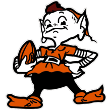 I would love to see the Cleveland Browns revamp the Brown Brownie (minus the crown, of course) and sport throwbacks that even Jim Brown would frown upon. Why not make the entire AFC North do this in 2012? It would be entertaining, possibly raise funds from fans who want unique “official” gear, and bring out the fun side of an era long passed.
I am not a professional jersey designer, but if NIKE can revamp a uniform…
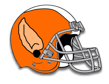
In 2012 every Cleveland player would be required to wear an orange helmet (for visibility) with elf ears on both sides (for balance). Maybe this will allow Colt McCoy to hear the plays better, or even assist the offensive line in not causing false starts. Either way, they\’re going to hear the crowd booing a lot easier. Very stylish.
As for their uniforms…make them wear orange and brown stripes with white pants at home. On the back, put ELF MCCOY so that the coaching staff doesn\’t have to call Santa Claus to figure out which player should be in the formation. Easy!! They can switch to orange and white stripes for away games with brown pants.
Cleats must have pointed toes and they must wear striped socks (to keep with the NFL\’s uniform policy). Note: The official brown color for Cleveland is called \’Seal Brown\’. Someone call Greenpeace!
- Baltimore Ravens
Since the Ravens used to be the Cleveland Browns, I thought it only fitting that they get a new look as well. Purple and Black? What were they thinking? Those are not good football colors at all. They make the guys that are “autumns\’\’ look so pale! The Ravens\’ mascot is, of course, a Crow. In a weird way they always make me want to caw at games. Here is my suggestion for their throwbacks (if you can call them a team that hasn\’t been in the league long enough to deserve them).
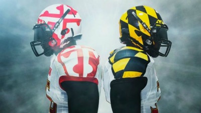 The University of Maryland has the right idea! The state flag should be on anything related to every team associated with, well, Maryland. Why not Baltimore. I offer this suggestion because the Ravens can\’t really rip off the university\’s jerseys (exactly) and we don\’t want Baltimore anywhere near our precious Pittsburgh black and gold (it isn\’t yellow!) And if they went with a scheme similar to the Orioles, they\’d join the ranks of the other AFC North rivals (of the Steelers) in sporting orange!
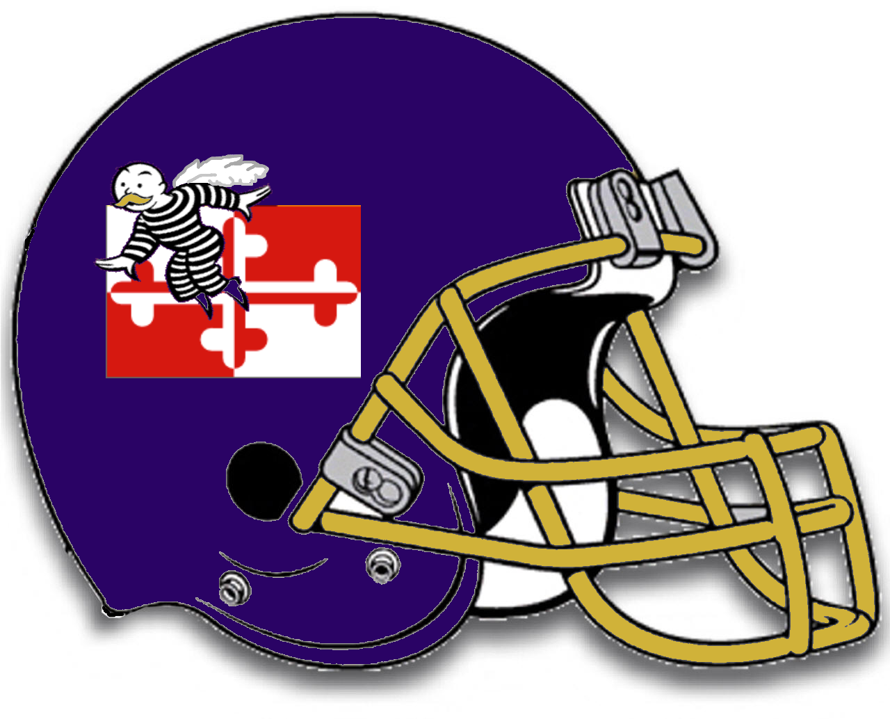
Keeping with the tradition of crow\’s (er, Ravens\’) wings, we have the ever-present “get out of jail free” man flying over part of the Maryland state flag. Granted, the helmet is a little plain, but not too different from the ones that Baltimore sport now. Ray Lewis will love this design.
As for jerseys, we\’ll let them have checkered ones (like the one on the right in the image above of the University of Maryland), but the entire jersey must be checkered in purple and gold. Period. Home games they can use the dark purple, but on away games they must use lavender. No deviation.
- Cincinnati Bengals
The Bengals have a pretty cool helmet considering the average state of the remainder of their uniforms. This may be because I really like Tigers, but I digress. I wouldn\’t change a thing about it, except to put a pretty placid looking white tiger on it as well. Nothing tough. Those types of tigers are for tattoos and in the wild.
Their new jerseys, should however, be changed to bright orange pants with (home) black jersey shirts with orange stripes and (away) orange jerseys with black stripes. Stripes seem to be the rage, so they should completely conform. In this case I am talking “tiger stripes”. They should not be uniform in shape or placement. The only problem I see with this scheme is that they may become so camouflaged that they will have good defensive backs but really poor receivers. Either way, it\’s an even situation that Pittsburgh could take advantage of.
 I recommend this tiger be the mascot and should be plastered on every bit of merchandise sold in 2012.
It\’s loveable, it looks cuddly, and even if Chad Ochocinco were still rockin\’ a Bengals jersey – he\’d find a way to make it stand out if he made it into the end zone.
My final thoughts (if you haven\’t already left the page) —
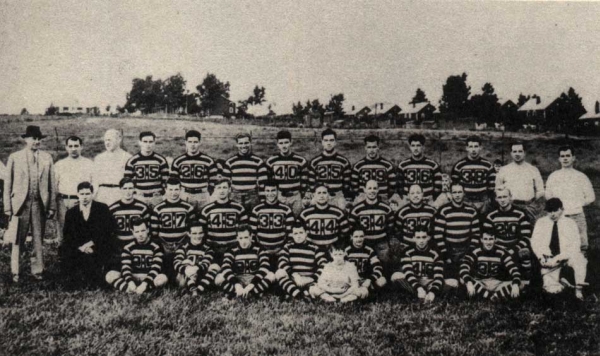
I am as die-hard as any die-hard member of Steelers Nation. I love the team, the organization and the fact that “The Chief” could walk-the-walk and talk-the-talk all while smoking a cigar. He was, quite frankly, “the man”. I don\’t want anyone reading this to think that I am putting down the team. I\’m merely pointing out that Team President Art Rooney II may have thought that going back to 1934 (when the Steelers could barely put a team together) may restore nostalgia. The word in fan circles is not nostalgia, but nausea. I sort of felt sorry for Isaac Redman having to pretend to be happy as he modeled the new \’old\’ look.
Please Rooney family and Steelers organization leaders, your fans are begging you to throw those throwbacks back into the burn pile because we\’re proud of our team, our heritage, the organization, etc. Unfortunately, some of us can\’t handle watching players run across Heinz Field in bumblebee fashion.
Taking a risk, if you are a professional jersey designer, feel free to email me at threeriverswriter@yahoo.com to give me better ideas. If you\’re just gonna rip me for stating the obvious (trust me, I am not alone in disliking these jerseys), know that I will simply smile and hit delete. Remember, this article isn\’t meant to create an argument, but merely point out how a lot of fans feel. The rest of it is pure ridiculousness.